
Cassi
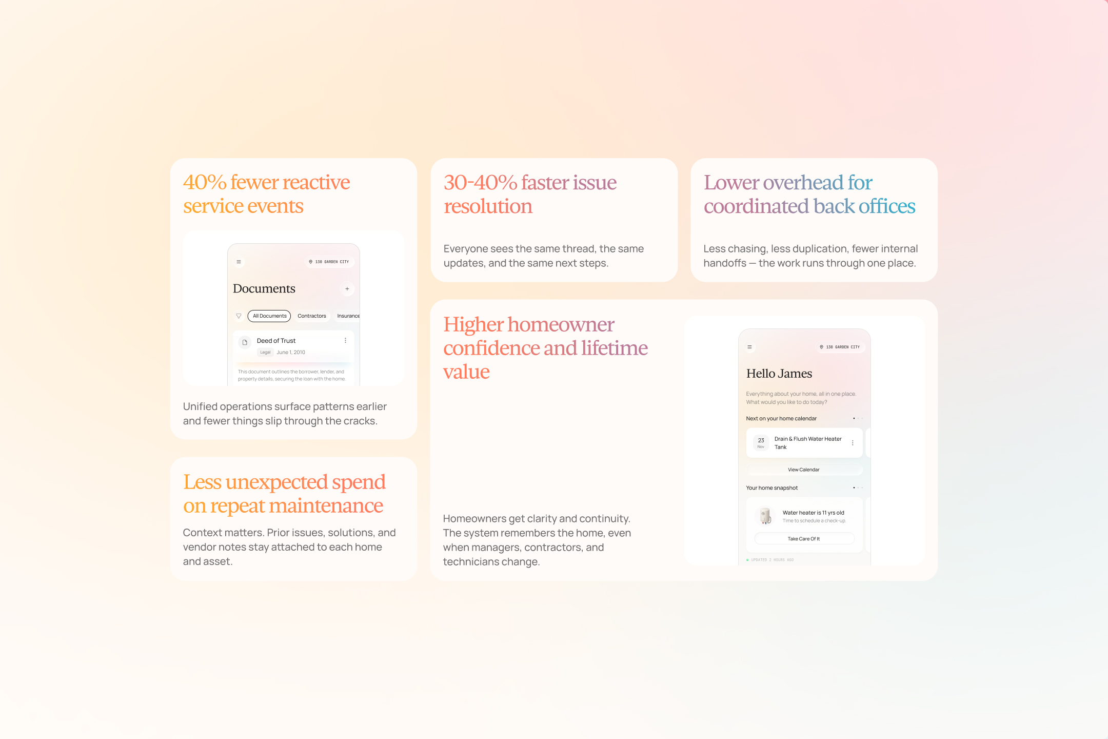
Home management is notoriously stressful. It's fragmented at best, even with solid systems in place. Cassi was born from that universal struggle, replacing the disjointed back office behind modern high-touch home operations, acting as the operating system for office, field, and homeowner operations.
Brand Strategy, Brand Identity, Messaging, UX/UI Design, Website Development, Animation, Illustration

When James Sullivan took leave to care for his mother as she battled cancer, he suddenly assumed the role of house manager, calling service providers, paying bills, and trying to stay on top of issues as they inevitably arise. It was completely overwhelming for him. That difficult period revealed something he'd always been aware of, but hadn't fully grasped: managing a home is exhausting.
Tools don't connect. Documents vanish into inboxes. Contractors get lost in text threads. The home, the most expensive asset most people will ever own, remains scattered and chaotic.
Cassi was founded after years of seeing how home operations actually run — across property management firms, service providers, builders, and high-touch residential environments. Despite the importance of the work, teams were forced to rely on texts, inboxes, spreadsheets, and disconnected software to keep everything moving. The insight was simple: this industry didn’t need another singular tool, it needed a true operating system.
Cassi was built to unify communication, work, and knowledge into a single platform that finally reflects how homes are managed in practice. The true power of Cassi lies in what you don't see, which follows our philosophy around how AI should be integrated and leveraged in businesses.
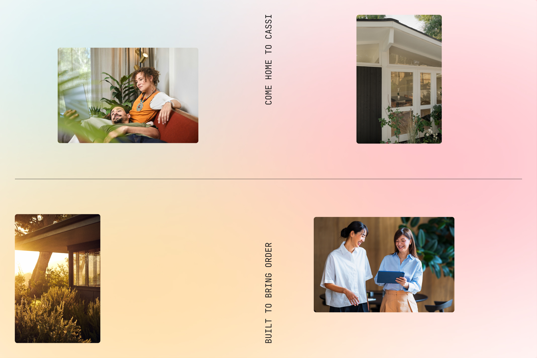
Although the tech behind Cassi is hidden and seamless, we wanted the experience to feel warm and familiar for users, not technical, rigid, and expected. Our positioning placed Cassi in an area of distinct ownability, bringing empathy and a sense of hospitality to an industry overrun by stiff and lifeless products. It was important to communicate that Cassi is with you for the long-haul, and not at a transactional level.



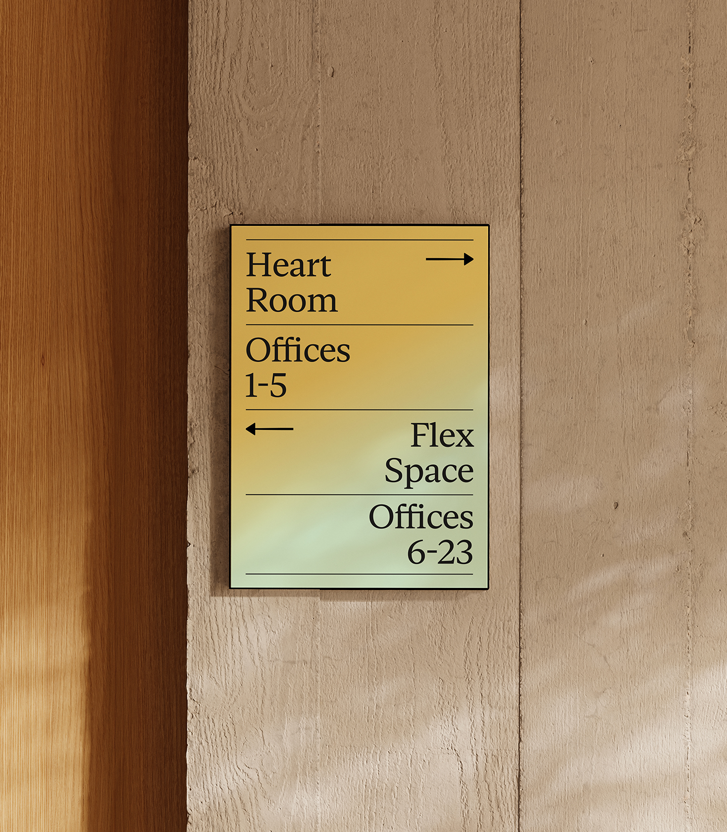

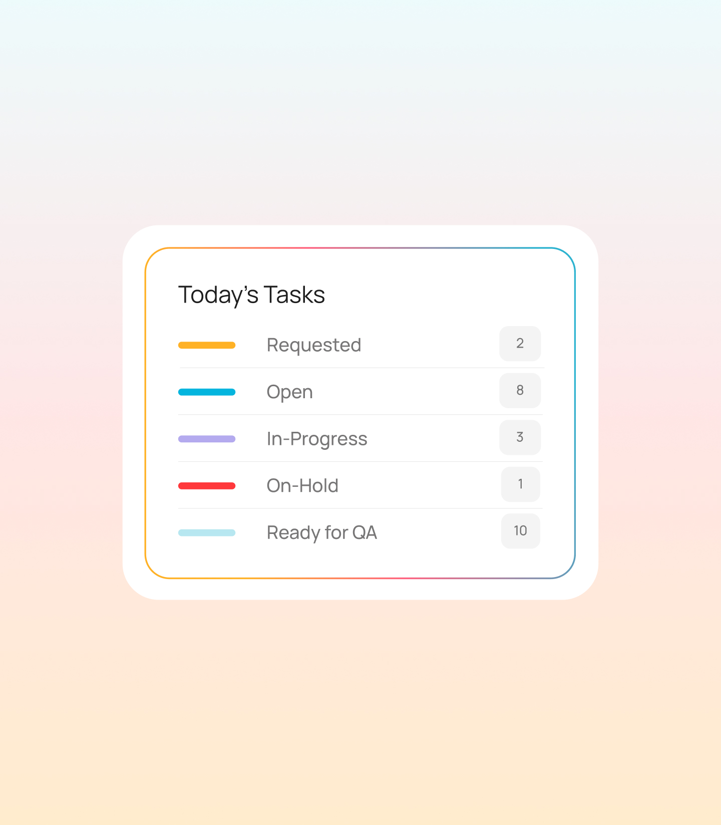
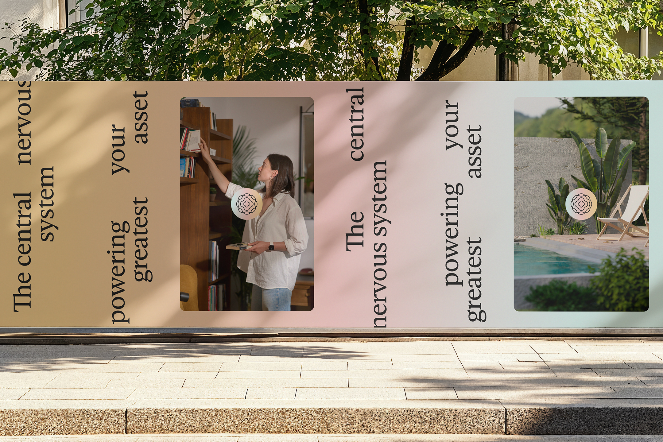
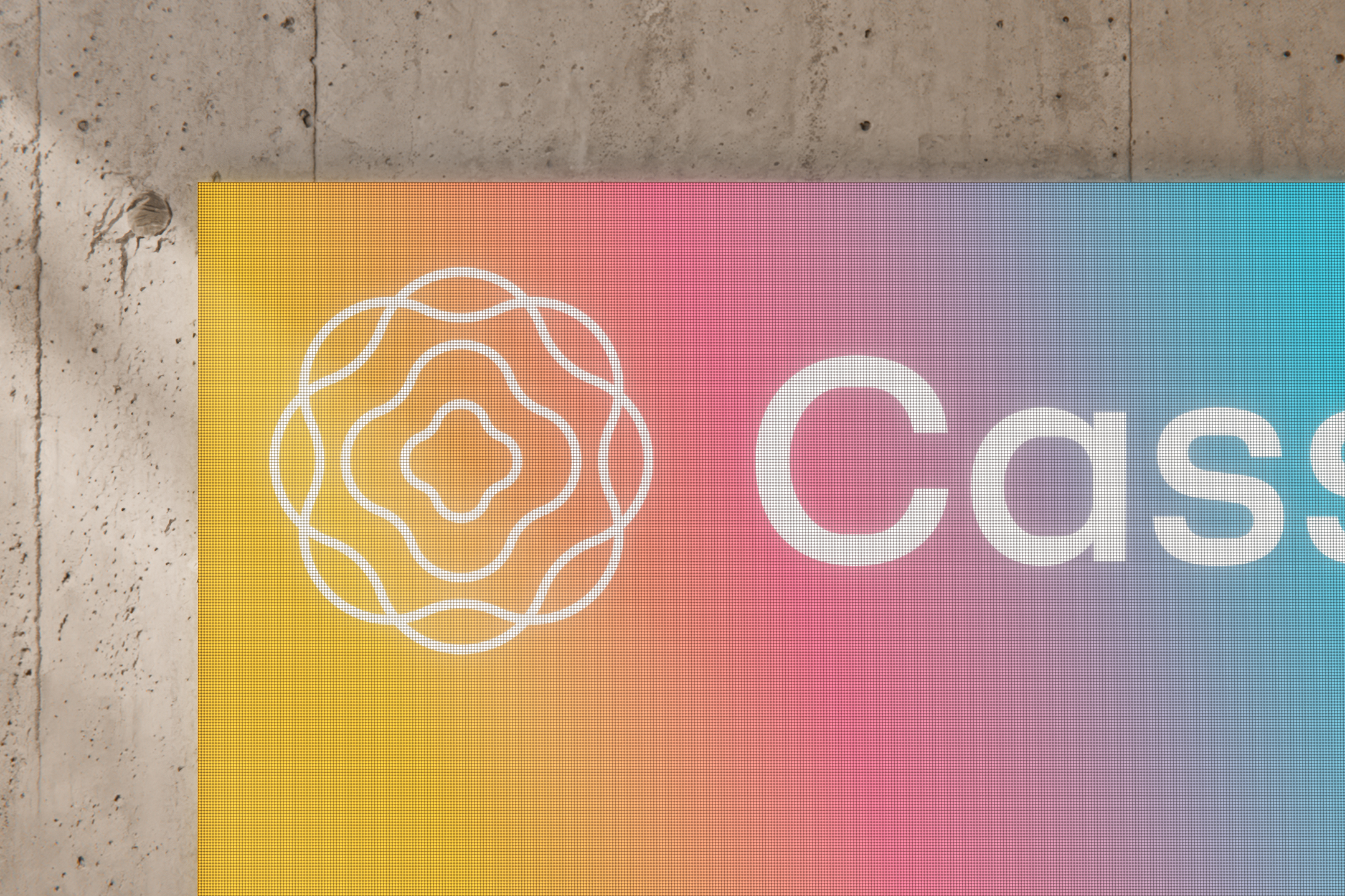
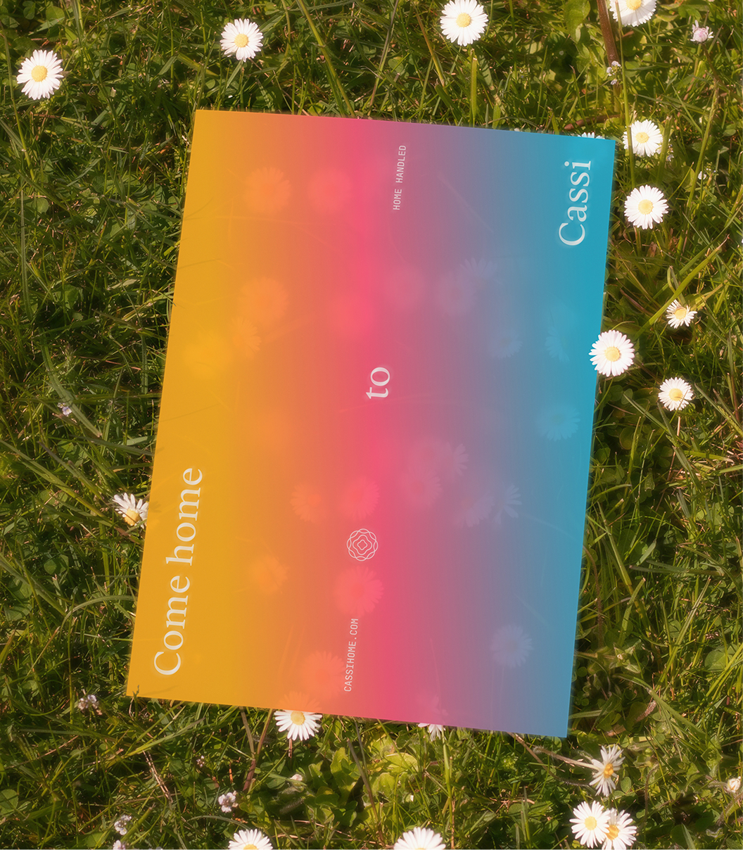
Using the brand to dictate the product feel, the brand world took on a biological symbolism, with Cassi acting as the central nervous system within your home. The color system pulls you from nostalgia to high-tech modernism, in all the best ways. The logomark represents a radiating heart, with variable simplifications for product storytelling. The logotype balances rounded counters with straight terminals to further build on the tension between human understanding and world class technology.
Our typographic system features Gestura for display, a sharp serif built on class and authority, pulling inspiration from 16th century old style tradition. As a lot of tech brands hastily slap on warm flowy serifs to communicate "friendliness" which often feels expected and basic. We selected Gestura to communicate an editorial inspired self-assurance. Our subheading typeface, F37 Lineca, a concept-driven typeface flexible at small and large sizes.
With an earlier emphasis on B2B before shifting into predominately B2B, we strategized a brand that could be fluid in nature, stretching across audience segments without losing the characteristics that are unique to Cassi. To further solidify this and help the Cassi team going forward, we built out a robust messaging and tone of voice framework that allows Cassi to flex from a homeowner audience segment, all the way to upscale property management companies without losing its special touch.
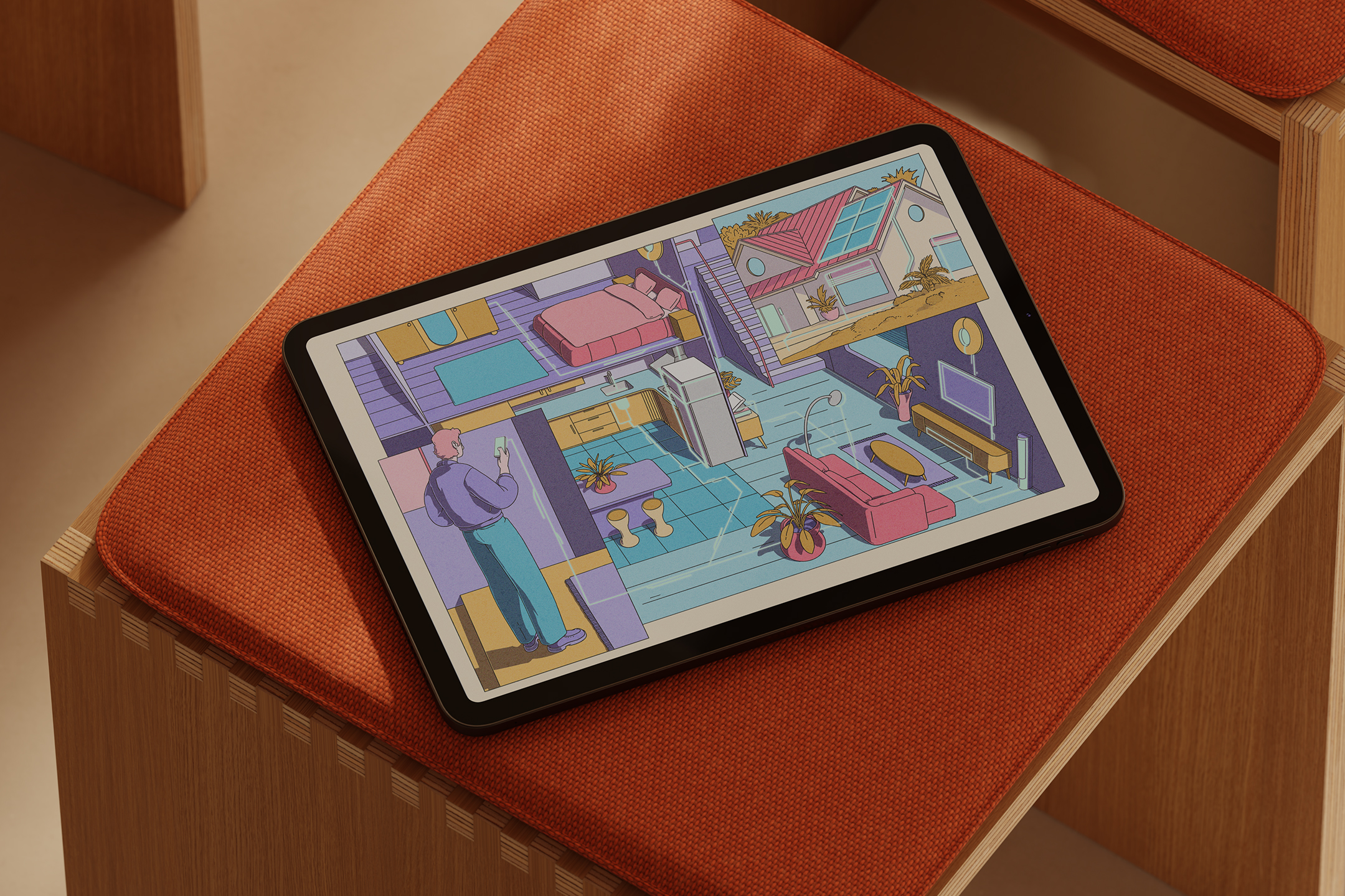
The entire system is pulled together with editorial-style illustrations done by Micha Huigen. The brief we gave to Micha was no small task - create an illustration set that could work on web, product, social, animation, and so on, but also can get hung up on the wall in your living room and look like fine art. Micha did not dissapoint.
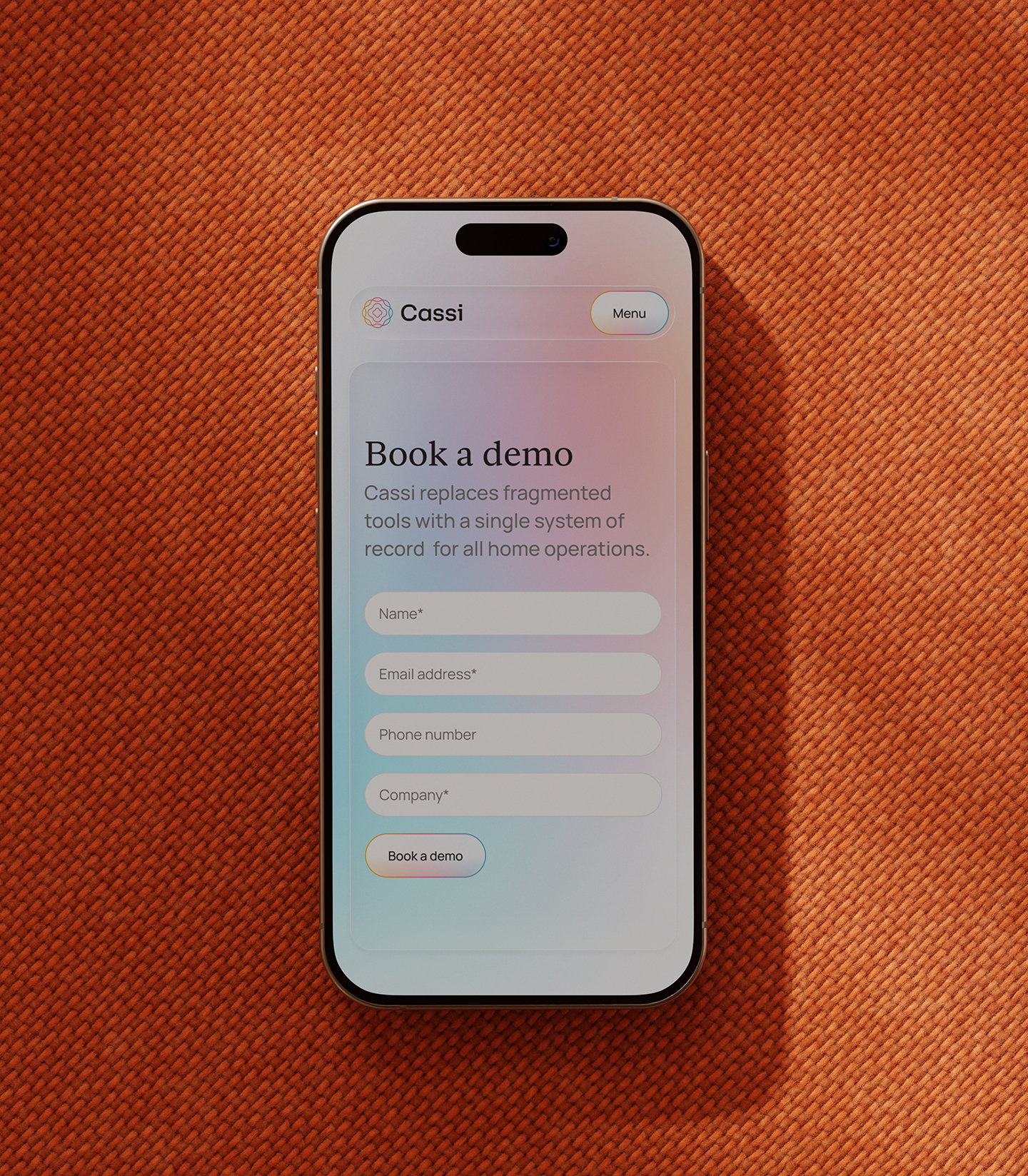
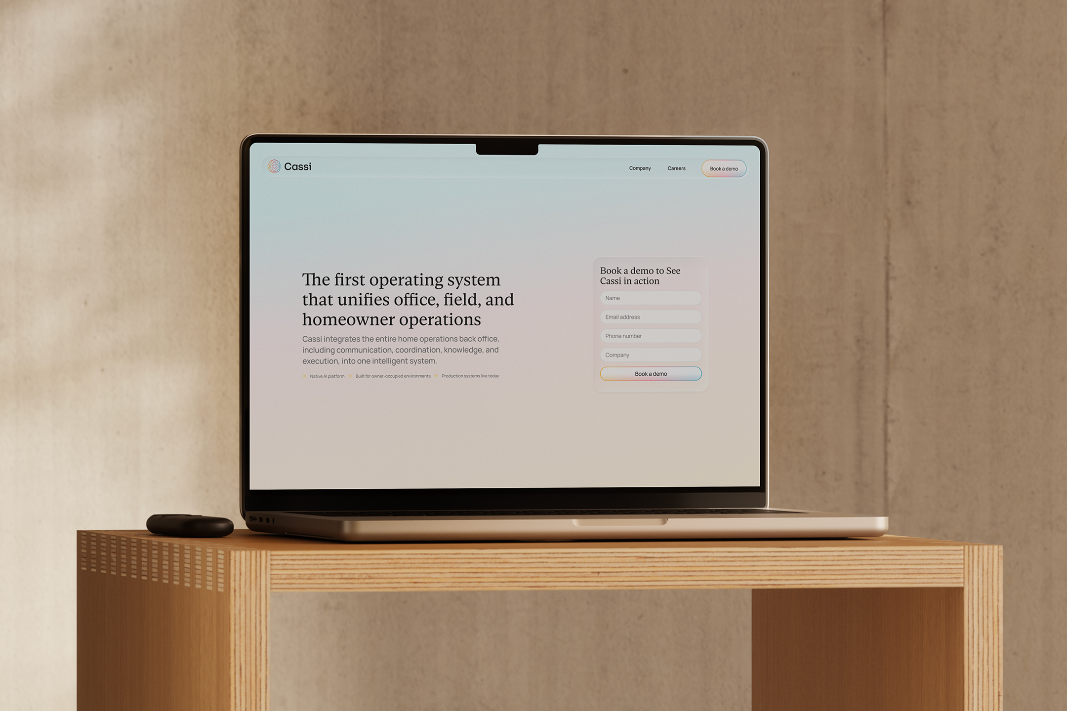
Following our identity work with Cassi, we worked closely with their team as the new system was implemented across their product ecosystem, and the culmination of the project was a custom marketing website. Knowing the important balance of story and conversion UX, we designed and developed a custom site for Cassi that featured scrolling animations, product UI videos, and a sense of minimal sophistication through interaction design.
It was such a pleasure working with the Cassi team on this. Thanks for trusting us. We can't wait to see this product launch into the world and make some waves in the home and consumer tech industry.


Client testimonial


Credits
Chas Appleby - Strategy and Messaging
Micha Huigen - Illustration
Waqas Khan - Development Lead
Leonardo Arna - Animation
